MENU
Using user insights and a new design system, we designed a new portal to help patients manage their mental health.
UX/UI Design, Branding
CATEGORY
Product Manager, UX/UI Designer, Developer
TEAM
UX/UI Designer
ROLE
BRIEF
WellPsyche offers therapy and psychiatric services for all ages. The company recently rebranded for a more inviting approach and needed a refresh to the user experience for its patient portal.
Wellpsyche new patients were down and many patients were leaving the service. Users were having trouble managing and connecting with their therapists due to an outdated patient portal. Growing frustrated with the portal experience, Wellpsyche needed to rethink the user experience of their dashboard.
THE PROBLEM
+30% USER SATISFACTION
+18% TASK COMPLETION
-25% ABANDONMENT RATE
RESULTS


DISCOVER + DEFINE

When patients found Wellpsyche, it was because they were seeking help with their mental problems. often times onboarding and the overall user experience of the patient portal left them feeling more frustrated and because of this enrollment was down and abandonment was up.
Patients seeking help often were left feeling frustrated.


-
Short turnaround time.
-
Product was outdated and hard-coded.
-
Make a case for mobile-first design.
-
Prioritize features to optimize.
-
Work with stakeholders to establish which changes to prioritize.
Challenges & Goal
-
Why did we need to change the design?
-
What were the expected outcomes of the changes?
-
How much time did we have?
-
What were our limitations?
-
What opportunities for enhancements did we have?
Discovery Questions
"As the lead designer I was tasked with refreshing the UI and optimizing the UX
for our 5-year-old product."

DISCOVER + DEFINE
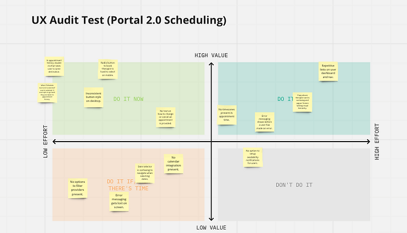
A UX audit identified current pain points and areas for improvement in the product, allowing us to enhance specific aspects without a complete overhaul in a short timeframe.
Conducting UX audits to uncover user insights
Enrollment was taking more than 15 minutes and over 50% of users were abandoning.
No option to contact a provider present.
60% of users were on mobile, but portal was not optimized for mobile.
50% of users did not know how to schedule multiple appointments
Visual inconsistencies across portal (pagination, buttons, colors)
No option to manage multiple accounts.
Insights

DISCOVER + DEFINE
As part of my product audit, I identified a lack of mobile optimization. In my research, I found that 60% of Wellpsyche users discover the platform on their mobile devices. with this data I made the case to switch to a focus on optimizing the portal for mobile.
The case for mobile first
users accessed the portal through phone
60%
users signed up for service through phone
56%
average time it took to book an appointment
20 min
User Journey Map
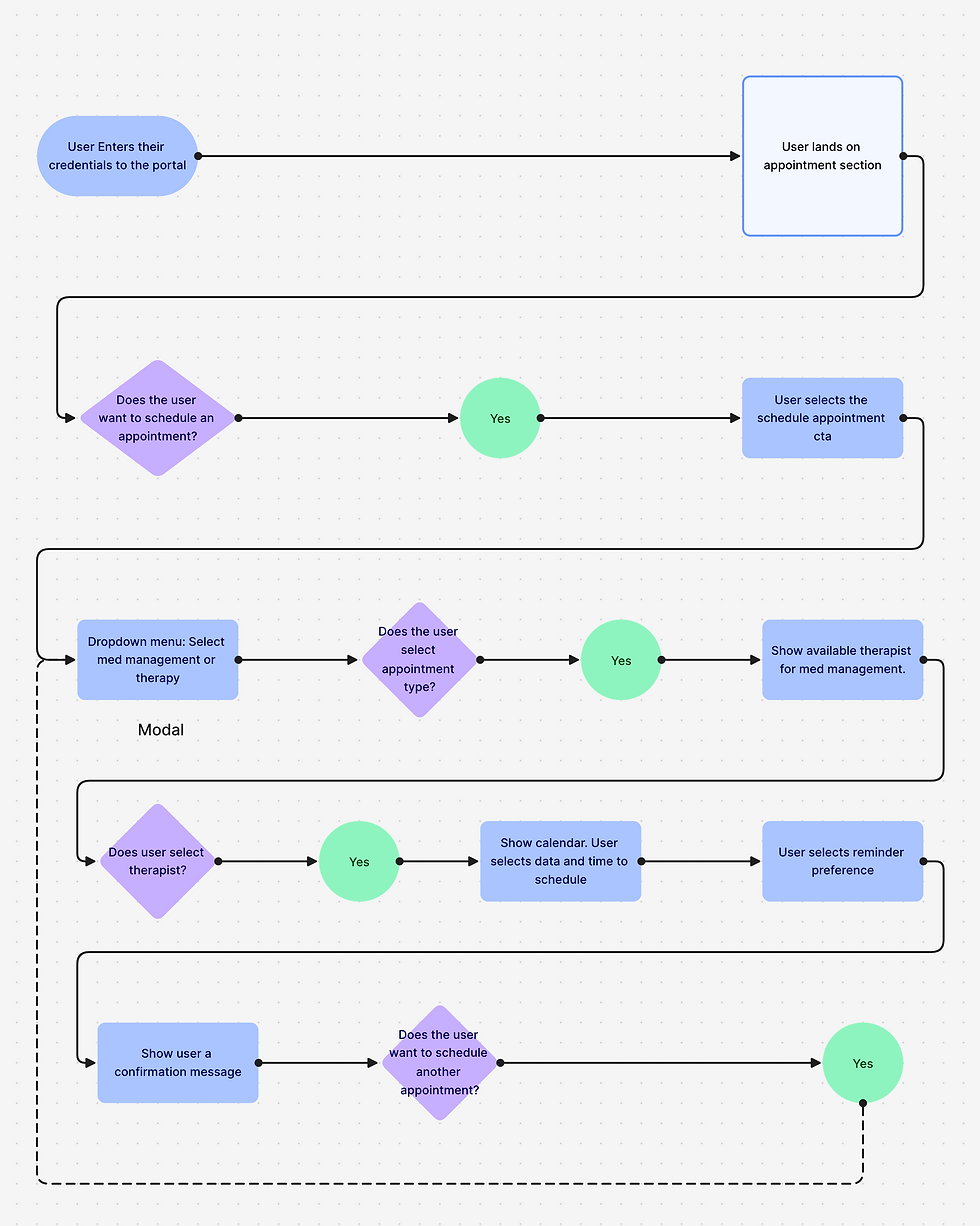
To enhance the portal's appointment management, I created user flows to identify current pain points and pinpoint areas for improvement, streamlining the user experience. This allowed me to get buy-in from stakeholders before jumping into creating the wireframes.
DESIGN SYSTEM + SOLUTION
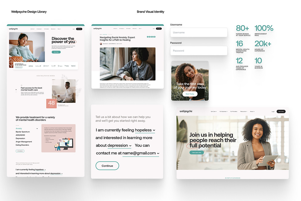
As part of the company rebrand, I initiated the development of a new design system to ensure consistent and efficient website redesign. Utilizing brand guidelines from the rebrand lead, I created various artifacts for building web pages. Subsequently, I updated components to align with visual changes introduced by an external agency tasked with auditing the brand.
Leveraging our new design system
Initial brand design & direction: Art Director
Design System & documentation: Andy Ramirez
Visual design updates made by: Design Agency


USER TESTING
During my testing I found that users were able to schedule appointments with more clarity and ease. It was a big win for the company because it would drive up appointment rates once developed and deployed. Helping cut down time trying to figure out how to get tasks done and navigating the web portal without ambiguity was accomplished through my redesign. Using the Heart Framework we came up with a set of metrics to test the new design against.
Validating our solution
Happiness: User feedback was positive and many were happy with the changes we made. 92% positive user feedback when asked about the look and feel and ease of use.
Engagement: Users were engaged when navigating the portal and did not abandon their tasks when asked to complete them.
Adoption: Before the changes were made, user abandonment was at 55% on mobile during the onboarding process due to it being so long and confusing. After our design changes, the abandonment rate dropped to 48% for users on mobile and further for users enrolling through the desktop.
Retention: This metric was to be measured by how many new users self-scheduled their first appointment within a week of enrolling to measure how many users would like to return and engage with the product.
Task Success: 80% success rate when asking users to schedule multiple appointments. This metric went up from the 50% rate of users being able to schedule multiple appointments.
CONCLUSION
Final Results
-
+30% User Satisfaction
-
+18% Task Completion
-
-25% Abandonment Rate
Our solution was a success and users were happy with the changes made. The new brand and enhanced portal experience helped users stay in touch with their therapist. Below are a couple of highlights from our testing.