MENU
Helping users find the products they want by designing an interactive shopping experience.
UX Design, Responsive Web Design, E-commerce design
CATEGORY
Producer, Lead UX Designer, Visual Designer,
Product Manager, Developers
TEAM
UX Designer
ROLE
BRIEF
Goodlife is an e-commerce brand that sells sustainable clothes. The company recently needed a new way to help users discover their products and increase sales while providing moments of delight for their customers.
Leveraging the Shopify Plus design library we designed an interactive quiz that helped users find the perfect t-shirt and discover new products.
WHAT WE DID
+3% IN T-SHIRT SALES
-2% ABANDONMENT RATE
+4% SOCIAL SHARES
RESULTS
.jpg)


DISCOVER + DEFINE
Establishing our task, goals and audience
Online shopping can get a bit dull after a while. Many users shop online every day and Goodlife wanted to create a new feature on their website that was engaging and would allow users to have some bit of fun while they shopped on their site. We started by aligning the business and design goals with stakeholders.
-
The site is built on the Shopify Plus platform, any features or optimizations have to adhere to the Shopify themes and their limitations.
Constraints
Goals
-
Help users discover and upsell new products
-
Enhance the customer experience
-
Let users interact and learn about the brand
-
Improve conversion rates
-
Increase sales from males buying t-shirts on the site.
Users often abandon carts due to an overwhelming array of choices. Improving product discovery to enhance ease and engagement is essential.
Problem Statement
How might we help users engage better with their shopping experience
and feel less overwhelmed when purchasing items online.
How might we
"Goodlife offers a wide variety of inventory on mens' t-shirts and with that, they needed a way for users to discover new products in a way that enhanced the customer experience and also drove conversions."
RESEARCH & DISCOVERY
We started by examining competitors to identify areas for improvement. Collaborating with the Lead Designer, I researched multiple companies and conducted a SWOT analysis to list and prioritize features for our solution. This exercise provided a solid foundation for our UX strategy, helping us understand existing offerings and ways to enhance them.
Looking at competitors

Creating these prioritization charts helped manage what improvements we could make immediately.

User Flows
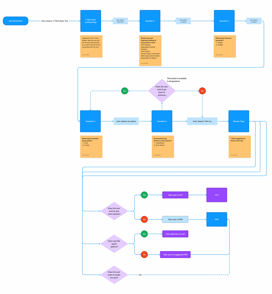
Creating the user flow helped stakeholders understand the different touch points the user would follow. We were also able to find potential pain points and solve them before moving into designing screens.
.png)
DEFINE
Implementing an interactive experience transformed user engagement and boosted conversions. Additionally, the quiz facilitated data collection on popular products, enabling the brand to enhance customer service through targeted marketing initiatives and promotions. After optimizing the UX with low-fidelity screens, we transitioned the design to the visual designer for high-resolution detailing.
The power of interactive shopping

We incorporated tooltips to help users get more context when navigating through the quiz.
It was important to let users know how long the quiz would take to prevent them from abandoning and to show the progress they had made.
Lo-fidelity Wireframes

Educating the users on the products was important but we didn't want to overwhelm the user with copy so we used modals to give the user power to turn them on or off.


Users can go back to a question and revise any of their answers.
The recommendation is shown to the user along with an option to add the item to their cart.
If the user would like to add more items or see other options they could add them to their cart by hovering on an item.
The user can retake the quiz or they can view the full catalog of products if they want to shop for more items.
USER TESTING
During user testing we came up with criteria to measure the success of our solution and see where we needed to improve or if there were major pain points that needed addressing. Using the HEART Framework method we came up with the following metrics and tested the mobile screens using Usertesting.com and Fullstory.
Validating our solution
1. Scenario Completion Rate:
-
Situation: Users successfully completing the entire interactive quiz.
-
Metric: Percentage of users who finish the quiz.
-
Insight: 100% percent of users who took the quiz finished. Some users expressed wanting to see more questions to discover different products beyond t-shirts and womens' clothing.
2. Time Spent per Question:
-
Situation: Assessing user engagement and pacing during the quiz.
-
Metric: Average time spent per quiz question.
-
Insight: The average time spent on each question was about 2 minutes. This pace would allow for more questions to be asked.
3. User Satisfaction (Post-Quiz):
-
Situation: Gauging overall satisfaction with the interactive quiz experience.
-
Metric: User ratings or feedback collected after quiz completion.
-
Insight: Most users found value in their results, and were satisfied with the items suggested to them.
4. Task Success Rate:
-
Situation: Determining how well users accomplish specific tasks within the quiz.
-
Metric: Percentage of users successfully completing purchase.
-
Insight: +3% of users completed their purchase. This metric needed to be revisited to see wether it was due to cart abandonment or if it was something specifically to do with the quiz.
5. Drop-off Rate:
-
Situation: Identifying points where users abandon the quiz.
-
Metric: Percentage of users who exit the quiz before completion.
-
Insight: Non of the users tested felt overwhelmed to the point of abandonment and no users described feeling like they wasted their time taking the quiz.
6. Click-Through Rate (CTA Buttons):
-
Situation: Evaluating the effectiveness of call-to-action buttons.
-
Metric: Percentage of users clicking on CTA buttons for each quiz section.
-
Insight: 56% of users successfully added the t-shirt to their cart directly from the results page using the add to cart button. Overall sales increased by 4% all time on t-shirts added directly from the quiz.
7. Personalization Effectiveness:
-
Situation: Assessing how well the quiz aligns with users' preferences.
-
Metric: Percentage of users expressing satisfaction with personalized quiz results.
-
Insight: 86% of users were satisfied with their results and described that the product recommended was close or spot on what they were looking for.
8. Accessibility Metrics:
-
Situation: Ensuring an inclusive design for diverse users.
-
Metric: Compliance with accessibility standards (e.g., WCAG).
-
Insight: Testing the quiz against the accessibility standards, it was mostly compliant.
9. Retention Rate:
-
Situation: Measuring the frequency of users returning to the quiz.
-
Metric: Percentage of returning users within a specified time frame.
-
Insight: Most users described the tool as a good starting point to their shopping experience and said they would use it again to shop.
10. Social Sharing Rate:
-
Situation: Evaluating the virality and social engagement of the quiz.
-
Metric: Percentage of users sharing quiz results on social media platforms.
-
Insight: 4% of users shared their results. This area needed major improvement. Alternatively most users coming from social media to the quiz had a higher abandonment rate because they were at the beginning of their customer journey.